Navigating the intricacies of e-commerce site architecture can be daunting, especially when dealing with large inventories. However, a well-structured site architecture is vital for ensuring a seamless user experience, improving search engine optimization (SEO), and ultimately driving sales. In this guide, we’ll explore the best practices for designing an efficient e-commerce site architecture that caters to vast inventories, focusing on site design tips, site navigation best practices, and overall e-commerce site architecture.
The architecture of your e-commerce site lays the foundation for its usability and accessibility. It’s not just about aesthetics; it’s about creating a logical and intuitive structure that guides users through your site with ease. A well-architected site enhances user experience, helps search engines index your pages effectively, and supports your SEO efforts. For large inventories, it ensures that products are discoverable and organized in a manner that makes sense to both users and search engines.
Summary
Large-inventory e-commerce sites require a logical, intuitive structure that balances user discoverability with crawlability and SEO. Prioritize clear, consistent navigation; well-planned categories and subcategories (with dynamic adjustments); robust search with filters; and readable, keyworded URLs supported by strategic internal linking. Deliver a mobile-first UX with responsive design, fast load times, touch-friendly controls, and strong visual hierarchy (clear CTAs, effective whitespace, consistent design). Boost visibility with schema markup, flatter click depth and streamlined navigation, and maintain performance through regular audits to fix links, refresh content, and monitor key metrics.
Enhancing User Experience
A thoughtfully designed e-commerce site architecture significantly boosts user satisfaction. When users can quickly find what they’re looking for, they are more likely to make a purchase. Intuitive navigation and well-organized categories reduce frustration and enhance the overall shopping experience, encouraging users to spend more time on your site.
Supporting SEO Efforts
Effective site architecture plays a pivotal role in your SEO strategy. By organizing your site logically, you help search engines understand the hierarchy and relevance of your pages. This improves indexing and can enhance your site’s visibility in search results. Proper categorization and internal linking also distribute link equity throughout your site, boosting SEO performance.
Managing Large Inventories
For e-commerce businesses with large inventories, maintaining a clear and organized structure is crucial. Without proper architecture, users can easily become overwhelmed by the sheer volume of products. An effective site architecture ensures that products are categorized logically, making it easier for users to navigate and find items quickly.
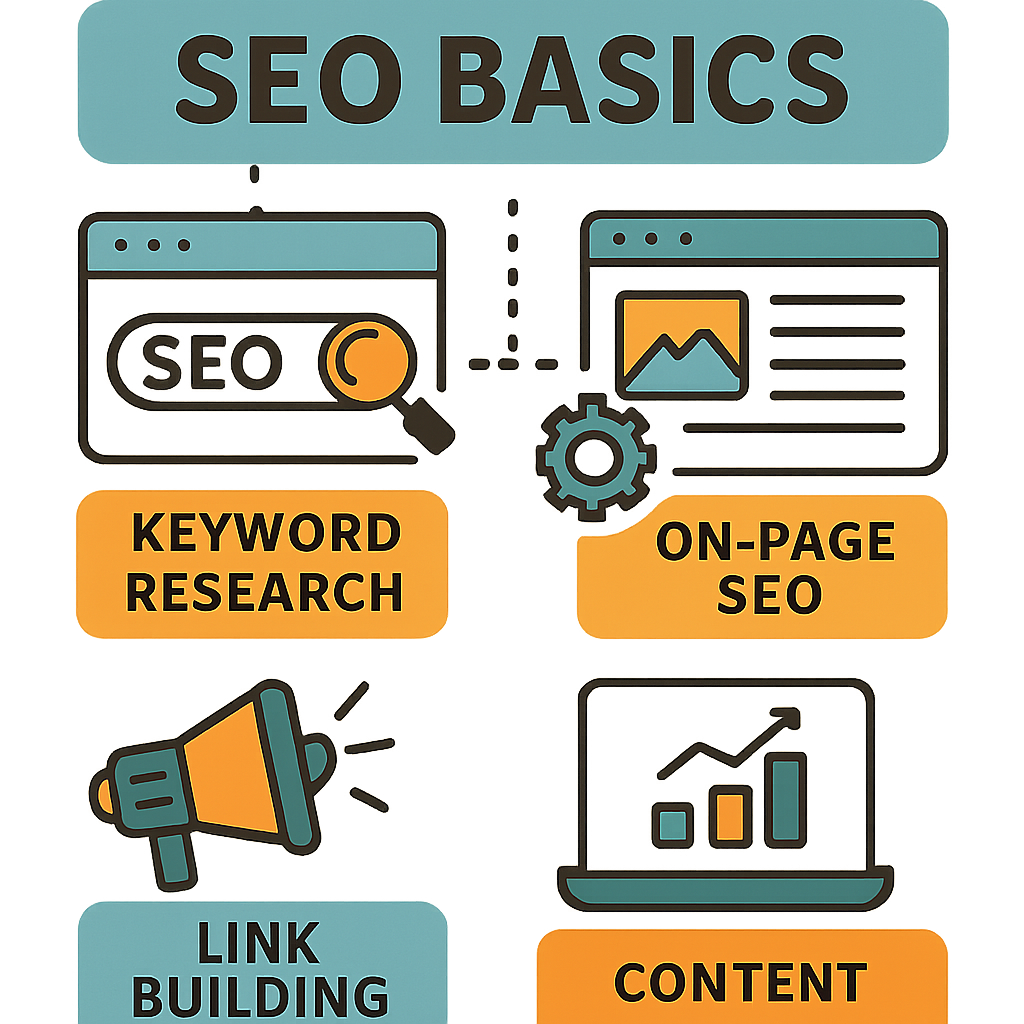
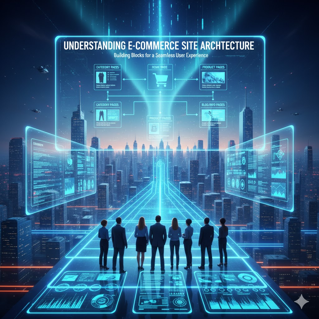
Key Elements of E-commerce Site Architecture
Clear and Consistent Navigation
Navigation is the map that guides users through your website. For large inventories, it’s crucial to maintain clear and consistent navigation to prevent users from feeling overwhelmed.
Main Navigation Bar
A well-structured main navigation bar acts as the backbone of your site’s navigation system. It should prominently feature primary categories that are visible on every page. Using descriptive labels helps users understand what each section contains, making navigation intuitive. Consistency in the navigation bar across all pages ensures users always know where to find what they need.
Breadcrumbs
Breadcrumbs are an essential navigational aid that shows users their current location within your site. They provide a trail of links back to previous pages, enhancing user experience by making navigation more manageable. Breadcrumbs are particularly beneficial for users exploring deep categories, as they offer a quick way to backtrack without starting from the homepage.
Search Functionality
A robust search function is indispensable for e-commerce sites with large inventories. It allows users to bypass complex navigation and find products directly. Advanced search features, such as filters and sorting options, further refine the search process, enabling users to locate products based on specific criteria like price, size, or brand.
Logical Categorization and Subcategories

For e-commerce sites with large inventories, breaking down products into categories and subcategories is essential. This logical grouping helps users find what they’re looking for without sifting through irrelevant products.
Top-Level Categories
Top-level categories should represent broad product areas, providing a high-level overview of your inventory. These categories act as the first point of contact for users, helping them narrow down their search. For instance, if you sell clothing, top-level categories might include Men, Women, and Kids. This approach simplifies navigation and reduces the cognitive load on users.
Subcategories
Within each top-level category, subcategories further refine the product selection. Subcategories allow users to drill down into specific product types, making their search more efficient. For example, under Men, you could have Shirts, Pants, and Shoes. This hierarchy ensures that users can quickly and easily locate the exact products they are interested in.
Dynamic Categorization
Dynamic categorization allows your site to adapt to changing inventory and user behavior. By analyzing user interactions and sales data, you can optimize categories and subcategories to reflect popular trends or seasonal demands. This flexibility ensures that your site architecture remains relevant and user-friendly over time.
Optimized URL Structure
A clean, descriptive URL structure is beneficial for both users and search engines. It should reflect the site’s hierarchy and include keywords where relevant.
Consistency
Consistency in URL structure across your site is crucial for both usability and SEO. Avoid unnecessary complexity in URLs, as this can confuse users and search engines alike. A consistent approach makes it easier for search engines to crawl and index your site, improving your site’s overall SEO performance.
Readability
Readable URLs enhance user experience by providing clear and concise information about the page’s content. Use hyphens to separate words, making URLs easier to read. For example, use /men/shirts/casual instead of /men_shirts_casual. Readable URLs also make it easier for users to share links, increasing the likelihood of organic traffic.
Keyword Integration
Incorporating relevant keywords into your URL structure can boost your site’s SEO. While maintaining readability, include keywords that accurately describe the page’s content. This practice helps search engines understand the page’s focus and can improve its ranking in search results.
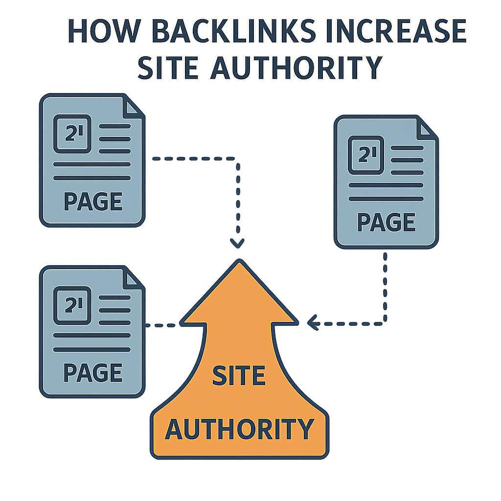
Internal Linking Strategy
Internal linking connects different pages of your site, allowing users and search engines to navigate through your site easily.
Related Products
Displaying related products on product pages is an effective way to encourage users to explore more items. By suggesting complementary or similar products, you can increase the chances of cross-selling and upselling. This strategy not only enhances user experience but also boosts your site’s average order value.
Cross-linking
Cross-linking within content guides users to relevant pages and keeps them engaged with your site. By strategically linking related articles, product categories, or promotional pages, you can increase the time users spend on your site and reduce bounce rates. Cross-linking also helps distribute link equity, supporting your SEO efforts.
Strategic Anchor Text
Using descriptive and relevant anchor text in your internal links improves both user experience and SEO. Anchor text provides context to users and search engines about the linked page’s content. By using keywords in your anchor text, you enhance the relevance of linked pages and improve their chances of ranking higher in search results.
Designing for User Experience
Mobile Optimization
With a significant portion of e-commerce traffic coming from mobile devices, ensuring your site is mobile-friendly is crucial.
Responsive Design
Implementing a responsive design ensures your site adapts to different screen sizes without compromising functionality. A responsive site adjusts its layout and elements to provide an optimal viewing experience on smartphones, tablets, and desktops. This flexibility is essential for catering to the diverse range of devices users may utilize to access your site.
Fast Loading Times
Fast loading times are critical for retaining mobile users, as slow sites can drive them away. Optimizing images and scripts is essential to ensure your site loads quickly on mobile devices. Techniques such as lazy loading, image compression, and minimizing HTTP requests contribute to a faster, more efficient mobile experience.
Touch-Friendly Navigation
Mobile users interact with sites using touch gestures, making touch-friendly navigation essential. Ensure that buttons, links, and interactive elements are appropriately sized for touch interactions. This approach prevents user frustration and enhances the overall mobile experience, increasing the likelihood of conversions.
Visual Hierarchy

by Sincerely Media (https://unsplash.com/@sincerelymedia)
Visual hierarchy guides users’ eyes to the most important elements on the page. Use size, color, and spacing to highlight key areas like calls-to-action (CTAs).
CTAs
Calls-to-action (CTAs) are vital for guiding users toward desired actions, such as making a purchase or signing up for a newsletter. Make your CTAs stand out by using contrasting colors and strategic placement. Clear, compelling language and prominent positioning ensure users notice and interact with your CTAs.
Whitespace
Whitespace, or negative space, is a powerful design tool that creates a clean, uncluttered look. By strategically using whitespace, you can make content easier to digest and guide users’ attention to key elements. A well-balanced layout with ample whitespace enhances readability and improves user experience.
Consistent Design Elements
Consistency in design elements, such as fonts, colors, and icons, contributes to a cohesive visual experience. A consistent design language reinforces your brand identity and helps users navigate your site with ease. By maintaining uniformity, you create a professional and trustworthy impression that resonates with users.
Enhancing SEO with Site Architecture
Implementing Schema Markup
Schema markup provides search engines with additional information about your products, improving visibility in search results.
Product Schema
Product schema markup is essential for e-commerce sites, as it provides detailed information about your products to search engines. Include details like price, availability, and reviews in your schema markup to enhance rich snippets in search results. Rich snippets can increase click-through rates by providing users with valuable information directly in search results.
Local Business Schema
If your e-commerce business has a physical presence, implementing local business schema can improve your visibility in local search results. This schema provides search engines with information about your business’s location, contact details, and operating hours. Enhanced local visibility can drive foot traffic to your store and increase online sales from local customers.
Review Schema
Review schema markup allows you to showcase customer reviews and ratings in search results. Positive reviews can build trust and influence users’ purchasing decisions, leading to higher conversion rates. By implementing review schema, you can display star ratings and excerpts from customer feedback directly in search results, attracting more clicks.
Reducing Page Depth
For SEO, it’s essential to keep important pages within a few clicks from the homepage.
Flat Architecture
A flat site architecture ensures that key pages are accessible within three clicks from the homepage. This approach improves crawl efficiency for search engines, making it easier for them to index your site. A flat architecture also enhances user experience by reducing the number of clicks required to reach important content, keeping users engaged.
Strategic Use of Categories
Strategically organizing categories and subcategories can help reduce page depth while maintaining logical navigation. By carefully planning your site’s hierarchy, you can ensure that users and search engines can quickly access important pages. This strategy enhances both usability and SEO, increasing the likelihood of conversions.
Streamlined Navigation
Streamlined navigation reduces complexity and makes it easier for users to find what they need. By minimizing the number of clicks required to reach key pages, you improve both user experience and SEO. A well-organized navigation system ensures that users can quickly access important content, keeping them on your site longer.
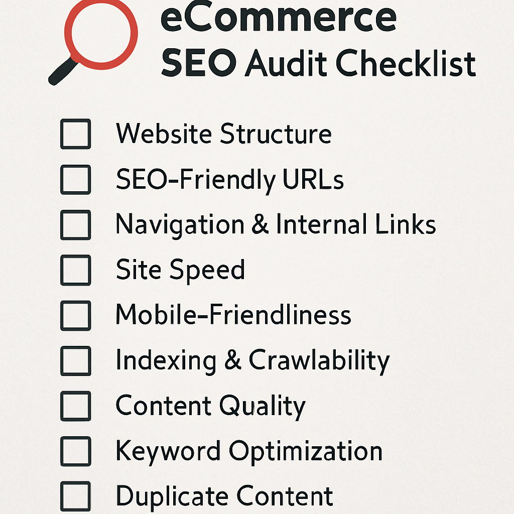
Regular Audits and Updates
Regularly audit your site architecture to identify and fix issues, ensuring it remains optimized as your inventory grows.
Broken Links
Use tools to identify and fix broken links that can hinder user experience and SEO. Broken links frustrate users and create a negative impression of your site. By regularly checking for and resolving broken links, you maintain a smooth and seamless navigation experience for users.
Content Updates
Keep content fresh and relevant to maintain user interest and search engine rankings. Regularly updating product descriptions, blog posts, and other content ensures that your site remains engaging and informative. Fresh content signals to search engines that your site is active, which can positively impact your rankings.
Performance Monitoring
Monitor your site’s performance to ensure it continues to meet user expectations and SEO standards. Use analytics tools to track metrics such as page load times, bounce rates, and conversion rates. By analyzing this data, you can identify areas for improvement and make data-driven decisions to enhance your site’s architecture.
Conclusion
A well-architected e-commerce site is the backbone of a successful online store, especially when managing large inventories. By focusing on clear navigation, logical categorization, and enhanced user experience, you can create a site that not only attracts visitors but converts them into loyal customers. Remember, your e-commerce site is an ever-evolving entity; regular audits and updates are necessary to keep it optimized for both users and search engines. By implementing these best practices, you’ll be well on your way to e-commerce success.
Q&A
How should I structure categories and subcategories for a large inventory, and what is “dynamic categorization”?
Use broad top-level categories (e.g., Men, Women, Kids) to reduce cognitive load, then add subcategories (e.g., Shirts, Pants, Shoes) so users can quickly drill down to specific items. Dynamic categorization means adjusting these groupings over time based on user interactions and sales data—surfacing popular, seasonal, or trending groupings—so the structure stays intuitive and relevant as inventory and behavior change.
What makes an e-commerce URL structure “optimized” for users and SEO?
Keep URLs clean, consistent, and reflective of your hierarchy, using readable hyphen-separated words (e.g., /men/shirts/casual rather than /men_shirts_casual). Include relevant keywords without overcomplicating the path. This clarity helps users understand where they are, makes sharing easier, and improves crawlability and indexing for search engines.
How does internal linking improve product discovery and SEO on large sites?
Internal links connect related pages so users and crawlers can navigate efficiently and link equity flows where it’s needed. Practical tactics include related-product modules, cross-linking to relevant categories or content, and using descriptive, keyword-relevant anchor text. The result: deeper engagement, reduced bounce rates, and stronger visibility for important pages.
What does a “flat site architecture” mean, and how many clicks should key pages be from the homepage?
A flat architecture minimizes click depth so important pages are typically within three clicks of the homepage. This speeds up crawling and indexing, and reduces friction for users. Achieve it with streamlined navigation and well-planned categories/subcategories, and sustain it through regular audits to fix broken links, refresh content, and monitor performance metrics.
What does mobile-first UX look like for large-inventory e-commerce?
It combines responsive layouts with fast loading (e.g., image compression, lazy loading, fewer HTTP requests), touch-friendly controls, and a strong visual hierarchy. Clear, high-contrast CTAs, effective whitespace, and consistent design elements make scanning and action-taking easy on small screens—boosting satisfaction and conversions.
Also Read: Solving E-commerce Duplicate Content at Scale: A Technical SEO Checklist
About the Author